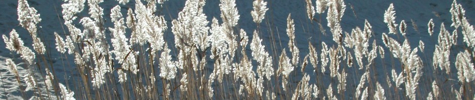
After reading the chapter on heat and cold, I was most interested in the color associations we make for each. Typically, I like to focus more on the scientific aspect of things, but for this section, art got my attention more. I find it interesting how we have color associations for each. Cool colors are considered to be blues, whites, grays, and greens. I think these colors are considered to be “cool” because they are seen in colder things more. When someone thinks of the winter, they probably think of snow, which is white, for example. In the Arctic and Antarctic, there are glaciers and icebergs floating in the sea, which is where white and blue also can come into play. On the other hand, warm colors are considered to be reds, browns, oranges, and yellow. They are also seen in hot objects and places, which is where I think these color associations are made. For example, a volcano is thousands of degrees, and the lava can be red, orange, and even brown. Here are some examples of paintings using warm and cool colors.
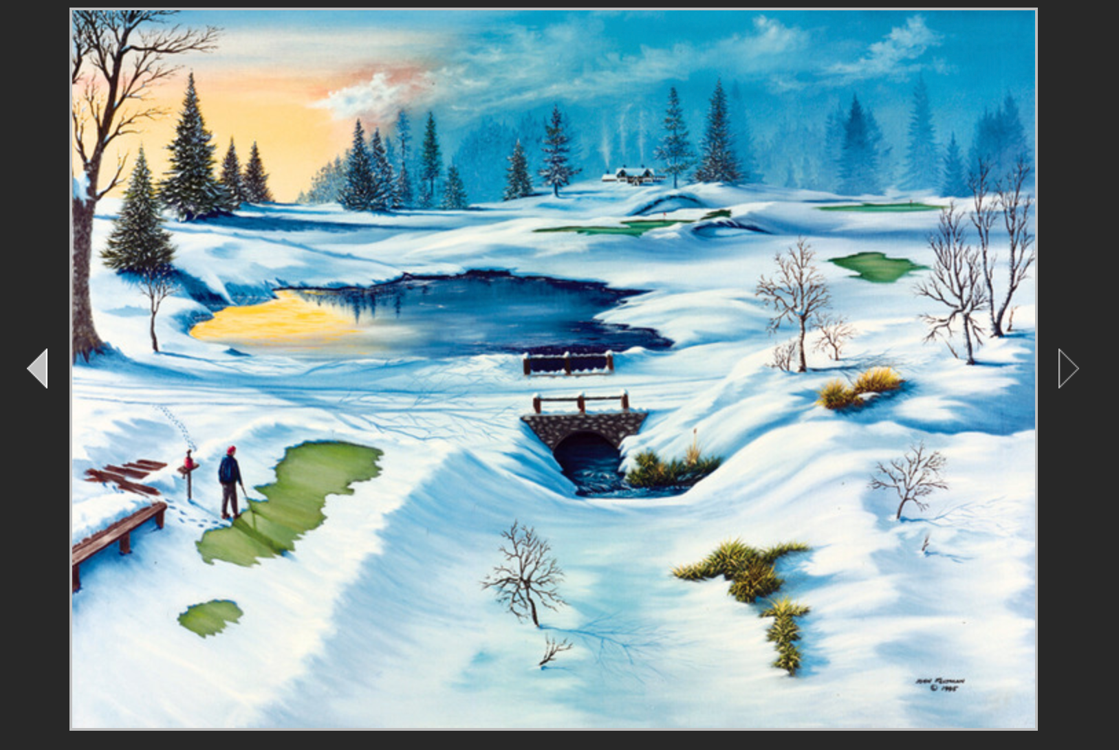
This painting was actually painted by my boyfriends’ grandfather, and it’s called “Almost Spring”. Here, he used cool colors to make a common, pretty winter landscape.
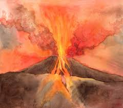
This is an example of a painting of a volcano, using warm colors.